 FA+
FA+
15503
Views
Views
1319
Favorites
Favorites
Category
All / All
Species Unspecified / Any
Gender Female
Size 984 x 836
File Size 551.5 kB
More from Tsampikos


![more late night [early morning?] bunny buns](http://d.furaffinity.net/art/tsampikos/1304677099/1304677099.tsampikos_bunbuns.jpg "Click to change the View")

more late night [early morning?] bunny buns
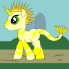
I really like my new jackelope + strawberryswirl character. I want to draw her butt a hundred times.
I decided that the last image's color scheme wasn't just a single image gimmick... but rather her actual colors.
I decided that the last image's color scheme wasn't just a single image gimmick... but rather her actual colors.
Category All / All
Species Unspecified / Any
Gender Female
Size 984 x 836px
File Size 551.5 kB


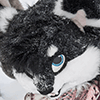


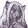

I would certainly not object to seeing more of this character. Truth be told, I find her more attractive to the eye than Mik. The color scheme is very easy to look at and works especially well where her upper body, ears, and hair mingle. Her stark blue eyes are also quite eye-catching; overall, she is very charming. How long did this take you to color versus line?
Aye. Mik was never originally intended to be eye-candy. I mean, she is for me... but there was more to her design than that. This one is pure id.... a combination of food and flesh. I imagine she taste and carries the scent of strawberries and cream just as much as she is intended to look the part... which is why I'm going to change her eyes to green in her next incarnation!
I'm going to miss the blue eyes... but I'll enjoy the rest of her. Seriously, though, I do love how blue her eyes are. It seems like there are so many characters with green eyes and I think her big blues really stand out. Can't wait to see more of her. She's a fantastic design. More id, please.
Her original eyes was green though!
http://www.e621.net/post/show/133729/
I switched it to blue for the sake of composition but I think keeping it strictly to concept my fare me a bit better (green being a component of strawberries where blue was completely arbitrary conceptually) if I can find eyes that aren't washed out by the rest of the body. I'm thinking if using a blue/green gradient at this point but first I need to do a proper full view concept image. Who knows what will change by then!
I do see that; I just like the blue better. The green eyes have that effect of when you shine a light in a cat's eyes, like they lack depth. The blue eyes feel more substantive. Please know that I'm saying this with the utmost respect for your work; I hope I am not coming across as telling you how to draw your character. Just as a matter of preference, I find the blue in this version more appealing, more soulful than the green in the former. She's attractive, either way, and I certainly would enjoy seeing her featured in more of your work. I'm probably in the minority as to preferring blue over green - I'm always in the minority when it comes to design decisions, that's why they don't even allow me to have colored pencils.

Haha, I'm not saying I don't like Mik's design - I just prefer this design which is clearly intended to be as female as female can be, as a simple matter of personal preference. Being a visually driven male, this design caters more towards my instincts of what female "should" be than Mik's design does, at some basic animalistic level. Rawr. Eat when hungry. Sleep when tired. Run when chased. Screw when possible. The four tenants of life.
I'unno, I personally find Mik more attractive... but then, you're a guy, and I guess your primal side has a preference for what this new girl more represents. Ah well~ I like Mik for being Mik. I like this new one too, but... Mm, well, she seems all around less appealing. That's me though~
Mm, you're both adorable. No critiques for this one; there's just not much to really say in that respect. The pose seems to be the most complex part of this piece, and you did that masterfully. There's no disjointedness between the hips and the torso, which is the biggest concern with a pose like this, so in all? Wonderful. On a note more for myself than the piece, I have to admit that I'm glad you chose to leave out the naughty bits. Not that it isn't wonderfully attractive when you make art of them in their full nude glory, but for this character, it... kind of gives her an air of innocence despite her pose. I don't know why, but this is something I find very lovable about the piece and this character.

Shoot...I think I like everything about this pic. Lovely pose and angle aside, you've really created a very cute and stunning jakelope character indeed. I like the soft color scheme you used to give her more of that strawberry-cream you're going for, and the anatomy looks great, considering the pose and angle you've drawn her in. Lastly, her cute long ears, poofy tail, and hairstyle with highlights here and there only add to her beauty.
I don't know if you've decided on a name for her or not yet, but it'd be awesome to see more of her in the near future! :) *proceeds to fave*
I don't know if you've decided on a name for her or not yet, but it'd be awesome to see more of her in the near future! :) *proceeds to fave*


Comments