
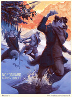
So being that I wound up using a pretty different process for this Heat cover than usual, I figured I'd share. I'll move this to scraps shortly <3
So usually, I just start throwing color around in Photoshop. It's always pretty rough and quick and approximate, but I generally have some idea of how I want the piece to look. I can at least get it close enough for some heavy Photoshop manipulation and color massaging to get it where it needs to go.
In this piece, though, I knew it was going to be a complex scene with a detailed background and a whole lot of figures, so I wanted to be a bit more methodical than usual. I started by blocking out the scene roughly in Photoshop, just trying to get the basic composition and major forms down. I played around with different kinds of perspective and general lighting schemes to make sure that the elements I wanted highlighted were highlighted, and the less important ones would attract less attention. I wound up going with a loose four-point perspective, and blocked in ten figures.
Once I had the basic poses figured out, I put out an APB among friends and recruited a bunch of kind folks to model. The coati and lion are roommates of mine, the fox is a friend (straight, and not furry, but a good sport <3) as is the ocelot. I didn't have any beefy models available, so the badger and bear are pieced together from 3~6 photos of beefy dudes from the internet each. The ringtail's torso and arm were based off a photo of a gal also found online, and then the rest of the cast is me self-modeling. Using these models as reference, I refined my rough sketch, then printed that out and used a light box and pencil to get my final, clean line work.
I raaarely work in pencil, but I do enjoy it. The pencils for the cover span two giant 14"x17" Bristol boards (the front cover and back cover on their own sheets, basically). I'll probably put those original pencils up for sale at some point, but for now, back to the process...
Next, I got to scan in those giant pages with my tiny scanner and piece that all back together in Photoshop, clean it up, etc. Using those lines, I then started painting in values -- the black and white structure of the painting. I tried to paint directly in color at that point, but the results were pretty gross. There was just so much going on, it was tough to keep the basic structure sound while also worrying about making color decisions, etc., so again, it was back to basics, and to doing things by the book.
Once the value painting was done (haha, like a month and a half later 9_9), it was time to start adding color to it. By gradually building up Overlay, Soft Light, Multiply, and Color Burn layers on top of the value painting, I was able to gradually introduce color without losing the value painting I'd spent so long on. For some areas, especially some highlights, painting directly in an opaque Normal layer was necessary to achieving nice, clean tones and getting the more painterly look I knew I wanted.
Once the color was added, it was just a matter of final adjustments, tweaking color with Color Balance and Selective Color, saturation with Vibrancy or Hue & Saturation, levels with Levels, etc. Then I saved out a flattened version, sharpened it up just a hair with Smart Sharpen, then sent it in and poured myself a drink.
It felt good to go whole hog with my process for a change, but I don't know that I'd go through the pencil and value painting steps on a less complex piece. They're great tools to help tackle big projects, but if they're not necessary to get you where you need to go, there's no shame in streamlining your process, either. Or so I'll tell myself <3
Anyway, I hope that was interesting for the process nerds out there! Cheers, guys
Category All / All
Species Vulpine (Other)
Gender Male
Size 553 x 845px
File Size 203.8 kB
This was really informative! Thank you so much for posting it!
I'm going to have to try coloring that way. I've never done a grayscale value complete then added color atop. I'll give it a shot!
Also as a side-note, if you self-modeled for the unicorn, does that mean you are actually in possession of an outfit THAT dapper?
Swank.
I'm going to have to try coloring that way. I've never done a grayscale value complete then added color atop. I'll give it a shot!
Also as a side-note, if you self-modeled for the unicorn, does that mean you are actually in possession of an outfit THAT dapper?
Swank.
I do actually own that blazer, yes <3 I was wearing it when I gave my last FC painting panel!
And I'm glad this was informative! Colorizing a value painting isn't my favorite way of working, and I'm trying to actively train myself to have a better understanding of value-in-color, so separating the two out like this can be kind of a crutch, BUT all that said, it was tremendously useful this time around.
One thing I WILL always do when I'm painting is toss a desaturation layer on top of my work and toggle that on and off at times, just to see what my values are doing. A lot of times, if a piece isn't "popping" right, and it just looks kind of muddy and bleah, it's because there's a problem with the underlying values. Seeing the piece in black and white lets you know that right away, so it's a super useful trick <3
Man, I have not worked with colour overlay-type layers in a long time. I guess that technique works better (and quicker) for a complex scene such as this. Some professionals even use it for quick concepts (concept art).
The outcome was inspiring! Thank you for sharing! :)
The outcome was inspiring! Thank you for sharing! :)
I don't know about "quicker," as it kind of added another step to my process (and one I'm not as familiar with), but it definitely helped me make sure that the scene stayed under control and that everything made visual sense. When I tried painting straight in color, it quickly devolved into chaos ^_^
ooo neat! that was really interesting. i see a lot of concept artists who do value drawings first and then do some color magic over it. i have yet to try it for myself. i've sometimes done value studies and then do pointing over them, but i've mostly done like you; throw color around in photoshop.
Yeah, if you're going to be thumbnailing, doing it in monochrome is def the way to go, I think. It lets you nail down all the important parts without fussing over color, then once you've worked out some designs you like, you can spend the time to slap on color.
But for finished painting type pieces, that's probably less of an issue? Like, you might sketch and block everything in quickly in a couple of basic tones (as I often do, although rarely in black and white) to keep it quick and loose, but when it comes down to the actual rendering, I'd personally prefer to work straight in color if possible. That just wasn't really an option for me this time because it was so huge and so busy that I couldn't keep it from turning into rainbow barf when I tried working straight in color <3 Going the value painting > color route gave me the training wheels I needed.
But for finished painting type pieces, that's probably less of an issue? Like, you might sketch and block everything in quickly in a couple of basic tones (as I often do, although rarely in black and white) to keep it quick and loose, but when it comes down to the actual rendering, I'd personally prefer to work straight in color if possible. That just wasn't really an option for me this time because it was so huge and so busy that I couldn't keep it from turning into rainbow barf when I tried working straight in color <3 Going the value painting > color route gave me the training wheels I needed.
Oh god, yeah. I'm a total reference whore. On any given piece (if I'm not being totally lazy), I'll have like a dozen photos I'm working from, whether it's pictures of animals or human models or what have you. And if it's a piece I care about (like a cover), I'll get friends to model and shoot a bunch of reference photos of them, both to make sure that I have exactly the reference I need, and because that way I'm not using random photos other people took. I don't think there's anything wrong with using random internet photos (I definitely do it), but yeah, if it's an illustration for publication, I try to avoid it when I can <3
I don't remember what it was for, but I needed reference of someone lacing their fingers, palms out, and stretching their arms out. Any complex hand studies have from me just modeling my own hands. A lot about proportions eludes me because I don't draw often enough for them to stitch into my brain, so I look at reference photos whenever I can.
Yeah, at one point I was talking with my roommate and he leaned over the back of a chain with his hands interlaced and I was like "I'M TOTALLY PAYING ATTENTION TO WHAT YOU'RE SAYING BUT DON'T MOVE." I ended up snapping a photo and that became Lee's hands in the Isolation Play poster I did.
Always take reference when you can get it ^_^
Always take reference when you can get it ^_^
I looked at that top image and thought, "Wow, that looks like pencil but it CAN'T be! :"D" You're one of the people I use as an example of someone who are utterly comfortable with digital media from start to finish (unlike myself). It's really interesting to see what instances an analog medium might be of use. And of course, it's always cool to hear how the basics of painting translate so well into the world of photoshop. It means that books on painting from the old masters aren't outdated and the approaches there still work. Thanks for posting this. As always, your process is interesting and inspiring.
Well, there's also the crass truth that I knew I wanted to go balls out on the illustration, but the fee wasn't especially large, and I figured that original pencils would stand a decent chance of selling in order to make up a bit of that discrepancy between time spent vs. compensation. Don't get me wrong, I like pencil work, and I'll pick pencil and paper over Photoshop for doing detailed linework any day (that's really the thing Photoshop is worst at). But yeah, if I'm being totally honest, there's a bit of an ulterior motive there as well 9_9
But all that aside, I do think that my process is fairly true to the classical model.
But all that aside, I do think that my process is fairly true to the classical model.
I've always thought your process was pretty much THE model of fine art painting and illustration. It still fascinates me that digital media work so well along these lines.
Also, the idea of there being a tangible artifact is not a slight one. I've seen this topic brought up in other venues as well, most notably with art made for comic books. Used to be that, like you in this case, comic artists used sales of 'original' art to supplement their incomes. With everything being done digitally, they weren't able to get this extra bit and so some of them had to take on extra gigs. It's a really interesting point, I think and worth bringing up. Good luck with selling the pencils. I know you'll do really well with them!
Also, the idea of there being a tangible artifact is not a slight one. I've seen this topic brought up in other venues as well, most notably with art made for comic books. Used to be that, like you in this case, comic artists used sales of 'original' art to supplement their incomes. With everything being done digitally, they weren't able to get this extra bit and so some of them had to take on extra gigs. It's a really interesting point, I think and worth bringing up. Good luck with selling the pencils. I know you'll do really well with them!
Eh, I think painting in Photoshop has as much in common with painting in oils as painting in watercolors does, after you get past the whole "except it's in a computer" part. The actual business of painting in terms of brush selection, color theory, layering pigment, form and light and anatomy, all that's the same. I have no doubt that if Photoshop had been around in Mucha or Leyendecker's day, they probably would've given it a whirl <3
That's cool! But, could you please tell me more about using the Overlay, Soft Light, Multiply and Color Burn layer options - specifically what makes you decide to chose between those? I've been using a similar process to this, actually, but I keep using Normal layers and maybe that's an area where I could be doing better.
Multiply works well for light color washes, similar to a watercolor wash over an area. A little bit will add subtle color to an area, but too much can make it too dark.
Overlay is probably the mode I used most. It will add nicely saturated color, and can give you a sort of bloom effect. Too much can blow out your saturation, though.
Soft Light is nice because it won't make your values too dark or blow out your saturation -- use it when the above two run into problems.
Color Burn gives super saturated, rich color, but it darkens things considerably. Use it for shadows, or in conjunction with a Soft Light layer.
For the record, Normal is totally my preferred way to work. You can accomplish a lot with washes and glazes (or the Photoshop equivalents, anyway), but for my own personal tastes, nothing beats laying down opaque pigment directly. Then again, I've got a huge bone for a more graphic style with thick, wet paint strokes like Leyendecker or Cornwell's, as opposed to the more glaze and wash-heavy classical painters. Both definitely have their place in a painter's repertoire <3
Oh wow, thanks. That's so much stuff I had no clue about.
So check me on this - normally when you're working directly in color, you have the opacity set at 100% or so, right? I'm sort of curious what levels of opacity you used on this one, since there's the big grayscale underpainting which you want to show through? The stuff I've been doing has all been around 20-35% opacity at most, and I haven't tried using big, really opaque color, yet.
Last, you mention sticking in a layer to check desaturation in your normal work - how does that one work, can I ask?
Sure! Okay, let's see:
So for normal paintings (ie not this one) yes, when I'm painting on a Normal layer I have it set to 100% opacity and paint with a brush also set to 100% opacity.
For this piece, on the color layers, it would depend on the blending mode. Multiply layers I'd generally set to about 30% opacity (it can also help to paint with lighter, less saturated versions of the colors you want to keep it from getting too dark), Overlay layers at maybe 60~70%, Color Burn layers at as low as 5~10% (they're pretty potent...), and Soft Light at whatever opacity it needs to be (they're pretty mild, so you can usually work pretty opaque).
And there are a number of ways to make a desaturation layer. Probably the simplest is just to make a new layer, stick it at the top of your stack, fill it with black (or white, or any 0% saturation grey), and set the blending mode to Color or Saturation. Or, if you prefer, you could use an adjustment layer -- make a Hue & Saturation or Vibrance adjustment layer, crank the Saturation slider down to -100, and you're set. Whichever way you prefer ^_^
witnessed firsthand that you did uncannily real-media digital pencil underdrawings on your PSD files, but i didn't know this one actually had a pencil on paper drawing (!) :0 whooaaaaa
thanks for your wishes on the passport -- absolutely need that to board my flight back home tomorrow, which, BTW I'll miss you muchly once i'm gone :x amidst all the stress and shitshow of this brief bay area visit, it was the greatest time talking to you and hearing your stories at the bar
thanks for your wishes on the passport -- absolutely need that to board my flight back home tomorrow, which, BTW I'll miss you muchly once i'm gone :x amidst all the stress and shitshow of this brief bay area visit, it was the greatest time talking to you and hearing your stories at the bar
There's no set amount, really, just like there's no "how many brush strokes should a painting be?" You keep adding until you have the look that you want, really. Sometimes I'll have two layers, other times it'll take thirty. You just kind of keep building and making adjustments until it looks right to you.
 FA+
FA+








Comments