7379
Views
Views
1455
Favorites
Favorites
Category
All / All
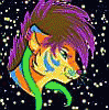
Species Leopard
Gender Any
Size 557 x 750
See more from hibbary


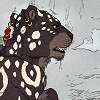
A companion piece to my last. This time I used two colors I cannot stand together--green and red. Though What I really can't stand is bright, saturated green and red. I can handle this :P
Same deal. I used reference, reproduced it freehand, and then just started painting. These uh... aren't very well planned out. They're more like painting experiments.
A few people asked about the materials I used. These are all acrylic (except for a little leftover pencil). I'll take all the leftover paint on my wet-palette, mix it into a desaturated mess, and cover a piece of bristol. I then stare at the paper and pretty much paint whatever idea pops into my head first. The parts of the process or finished painting that work I'll take note of and keep for the next painting.
Also, I'll put up prints of this and the last one when I have a quality photo.
Category All / All
Species Leopard
Gender Any
Size 557 x 750px


oh man i hate [saturated] green and red too. can never do anything with those two colors without everyone thinking CHRISTMAS
This looks fantastic though, excellent <3
This looks fantastic though, excellent <3
Christmas, yes. Not only that, they're just hideously ugly. The only complimentary colors I really enjoy together are blue and orange. Yellow and purple are meh. Green and red... BLUUURGH!
I'm orange and blue
finally someone who gets it
I've had alot of comments about it being hard on the eyes, but I love the way blue and orange look together
finally someone who gets it
I've had alot of comments about it being hard on the eyes, but I love the way blue and orange look together


http://3.bp.blogspot.com/-QkPMJiSem.....gigas%252C.jpg Largest scaled freshwater fish.


I can't stand green with red either! Purple and yellow...great. Blue and orange...fantastic! Green and red...bleh, no thanks. :(
This did turn out pretty neat though, I love the concept. Reminds me of How the Leopard Got His Spots. :)
This did turn out pretty neat though, I love the concept. Reminds me of How the Leopard Got His Spots. :)

I think the color combo works very well. Neither overpowers the other.

Well done indeed. Something I'd confidently say I'd hang in a home without abandon. Something that would be proudly shown off! Thank you for posting!


Oh see now I am torn. This one or the other one...Think I will stick with the other LOL I like the teal. Though this is really really epic! If there is more...can't wait to see 'em. Cheetah is begging to be done me thinks!

Very nice :) I couldn't comment on the previous one (which was also cool) as a tiger I know would take that as some kind of victory :D


Oh man this really IS magic. I am in love with the composition and the way the spots follow the implied shape of the cat, and then turn into stripes.

So stunning. I do so love your work, on my wishlist of art I would like to own one day. Just stunning.


Great work! I too don't like looking at bright green and red together, but I really like this!


Oh my GOSH, my FAVORITE color pair is dark red and greenish blue... I don't know why, but I just love them together. There's something royal about them. Or maybe blood in the ocean. Maybe I was a shark in my past life HMMM
This is so beautiful, though. hnnnggg
This is so beautiful, though. hnnnggg


I like this.. To me it gives the impression of coming together and rising from water.

even though they are just "painting experiments" they have come out as damn great pieces. I hope to see more of these in the future because they are awesome

gosh. everything about this.
it almost looks like rose pedals in a bed of water from the thumbnail, i love it!
it almost looks like rose pedals in a bed of water from the thumbnail, i love it!
What would you think about taking a commission for one of these? This is just fantastic!
This looks lie as if it was literally coming out of the wall I love the olive drab muted green, like those old style paint jobs where arsenic was used to make the green, and the red a color combination with something and iron oxide, I think excellence in experimenting.


Seems like a lot of artists don't like green and red together. I think they work, but then again, I can't draw or paint for crap, so what do I know. ;) Great work here.

Wonderful effect, like the kitty's rising up out of a watery layer, or even wallpaper! FUNNESS!


Ahhh I’m so glad you’re making prints of these I HAVE to get them.
I seriously love both of them to death. I love the way it kinda breaks away from the animal into a design.
And the colors just totally make it.
You’re a very skilled painter ^_^
I seriously love both of them to death. I love the way it kinda breaks away from the animal into a design.
And the colors just totally make it.
You’re a very skilled painter ^_^

I like all three of your "Magic" paintings, though this one is undoubtedly my favorite. :) Also, I'm sure a lot of other people will feel the same way about those paintings.
If I may be so bold ... but I think the other two paintings are lacking in some aspects compared to this one. Even though all three paintings do follow the same lovely concept and are technically very well done, the individual concept of every piece is always a little different.
If you want me to, I can write a few lines, trying to analyze the positive aspects of this painting compared to the other two paintings. But then again that probably won't be necessary since you most likely already know most of the things I'd mention anyway. :)
Anyway, well done, I really like the concept of those paintings. :)

Is this one you will be selling prints of? I would love a print of this. Same with the tiger one.


This was my absolute FAVORITE print I saw at the AC art show. Your whole set up there was fantastic, incredibly eye catching, and you could just walk in and do a 360 and be assaulted by awesome colors. I really enjoyed it, and I love your work!

This (and the other one) is gorgeous, I would honestly love to see more experimental stuff like this in the future. How big was the actual piece?
Comments